Weather and energy are deeply connected—especially as the world shifts toward renewables like solar and wind. These energy sources rely directly on the weather: sunshine powers solar panels, and wind turns turbines. Because of this, accurate and timely weather data is essential for predicting how much energy we’ll produce or need at any given time.
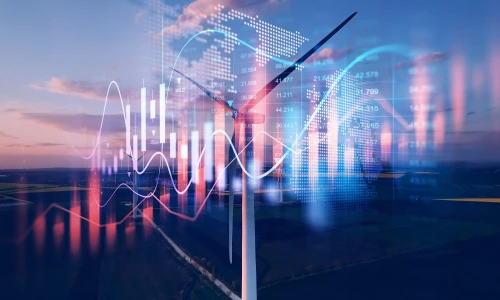
But raw weather data can be overwhelming. Forecasts, wind speeds, irradiance levels, temperature variations—these are all critical pieces of information, but they’re not always easy to interpret at a glance. That’s where visualising weather data comes in. By turning numbers into maps, charts, and dashboards, we can quickly make sense of complex data and use it to make smarter decisions in the energy world.
Let’s explore why visualising weather data is so important for energy production, planning, and performance.
Why is weather data crucial in energy forecasting?
When energy came mostly from fossil fuels, weather didn’t play such a big role in forecasting supply. But now, with growing amounts of solar, wind, and hydropower, energy generation depends more directly on the skies.
For example:
Cloud cover affects how much sunlight hits solar panels.
Wind speed determines how efficiently turbines generate electricity.
Temperature swings impact both energy demand (like heating and cooling) and power plant efficiency.
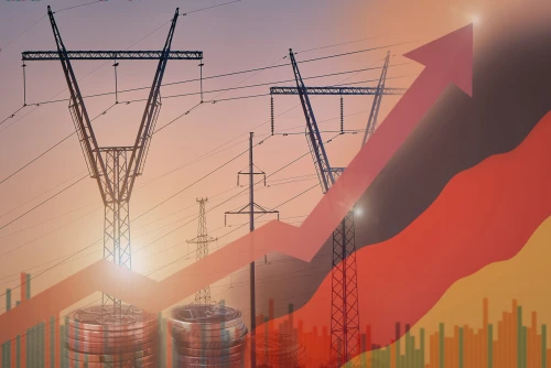
In fact, the International Energy Agency (IEA) points out that renewable generation is more variable and weather-dependent than traditional energy, making accurate forecasting absolutely vital for grid stability.
Short-term forecasts help grid operators manage supply and demand in real-time, while long-term weather patterns inform project planning, storage strategies, and investment decisions.
How does visualisation improve understanding of complex weather data?
Raw weather data is dense and technical. It’s often made up of spreadsheets full of numbers or satellite files that require specialised tools to process. For most users—especially energy planners, project developers, or trading desks—that kind of data isn’t practical on its own.
Visualising weather data helps transform it into usable insight. Here’s how:
Maps can show solar irradiance or wind speeds across regions, helping developers choose optimal locations.
Time-series charts display patterns like wind variability over the day or seasonal temperature trends.
Dashboards can combine real-time weather forecasts with live energy output for easy monitoring and decision-making.
Good visualisation bridges the gap between complex science and operational decision-making. It allows both experts and non-experts to interact with the data, spot trends, and act on insights.
Use cases for weather visualisation in energy
There are many ways weather visualisation is used across the energy sector. Let’s look at a few practical examples:
1. Solar energy optimisation
By visualising solar irradiance across days, weeks, or seasons, operators can predict PV system performance. It helps them adjust operations, schedule maintenance during cloudy periods, and plan battery storage use based on expected sunlight.
2. Wind energy forecasting
Wind speed and direction are crucial for turbine efficiency. Visualising wind forecasts and historical wind maps allows energy producers to better estimate output and reduce curtailment (where wind energy isn’t used due to overproduction).
3. Grid load balancing
Weather conditions like heatwaves or cold snaps have a big impact on electricity demand. For example, high temperatures increase air conditioning loads. Utilities use temperature maps and demand forecasts to balance supply and demand in real time.
4. Extreme weather preparedness
Storms, floods, or wildfires can threaten power infrastructure. Visualisations of incoming weather systems allow operators to take proactive steps—shutting down turbines safely, staging repair crews, or communicating with customers.
5. Energy trading and market strategy
Weather affects electricity prices. Traders use weather maps and predictive models to anticipate supply and demand fluctuations—buying or selling energy at the right time. Visualisation tools make it easier to respond quickly to changing conditions.
Tools and technologies enabling better weather visualisations
In recent years, a range of tools and platforms have emerged to help energy professionals visualise weather data more effectively.
1. APIs and satellite data
APIs from services like NOAA, ECMWF, or commercial weather providers allow real-time weather data integration. High-resolution satellite data gives detailed information on clouds, radiation, and precipitation.
2. Energy analytics platforms
Specialised platforms now combine SCADA (supervisory control and data acquisition) data from energy systems with weather forecasts, displaying it all in one interface. This allows energy managers to see how the weather is directly impacting generation at any moment.
3. AI and machine learning
Some platforms use AI to create predictive models that learn from historical weather and production data. This enhances forecast accuracy and helps identify patterns that aren’t obvious from raw data alone.
Visualiaation powered by these technologies helps energy companies respond more quickly, reduce downtime, and improve efficiency.
Benefits of visualising weather data for energy management
Here’s a summary of the key benefits that weather visualisation brings to the energy sector:
Improved forecasting accuracy
Visualisations help energy planners interpret models more easily and detect outliers or trends, boosting forecast reliability.
Better operational planning
By seeing forecasts visually, energy producers can plan turbine or panel maintenance during low-output periods and optimise storage use.
Enhanced decision-making
Operators, analysts, and traders can make faster, smarter choices by interacting with visual dashboards rather than scanning raw data.
Increased grid reliability
Forecast-informed decisions help prevent blackouts, manage grid stress during peak demand, and reduce reliance on fossil backup.
Cost and risk reduction
Weather-related risks like curtailment, equipment damage, or poor market timing can be minimised with proactive, visual-based planning.
Weather is one of the most powerful forces shaping the energy landscape today. As we move toward a cleaner, more variable energy future, the ability to understand and anticipate weather impacts will be a key advantage.
Visualising weather data makes this complex information accessible, actionable, and valuable for everyone—from engineers and grid operators to traders and energy buyers. It transforms numbers into stories and forecasts into strategies.
Whether you’re trying to maximise renewable energy output, protect infrastructure from storms, or simply get ahead of a market shift, clear and interactive weather visuals can give you the edge.